Work About Résumé ↗
Gratitude by Tech4Good — platform mockup

Role

UX Design
UX Research
Animation

Timeline

March 2020 – June 2021

Tools

Figma
Adobe After Effects

Team

Design Team (4)
Research Team (5)
Prof. David Lee

Gratitude platform on MacBook

How can we capture the emotions of receiving a gift and translate it into a digital realm?

UC Santa Cruz's Tech4Good Research Lab is dedicated to exploring the intersection of computational systems and social interaction.

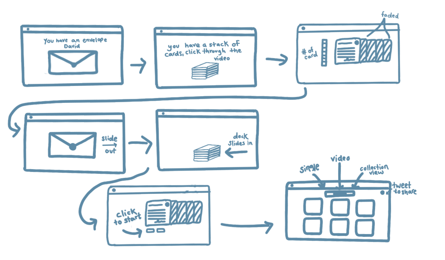
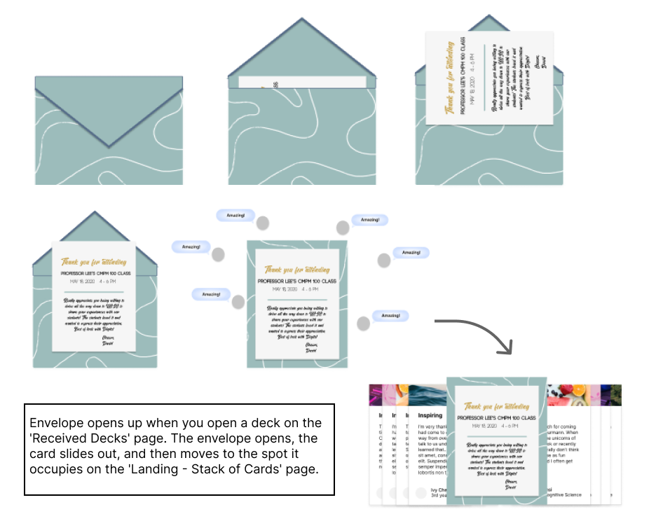
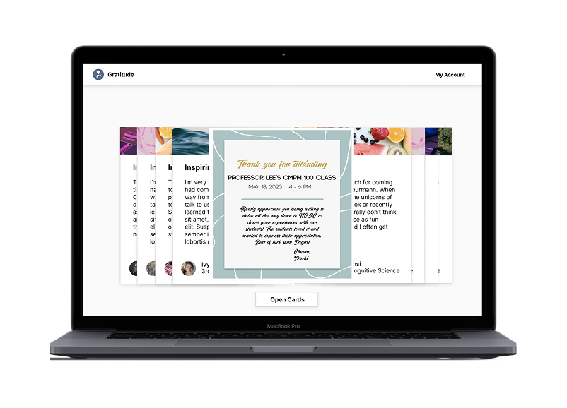
When the pandemic hit in March 2020 the Tech4Good Research Lab wanted to find a way to show thanks and uplift members of the community in a safe, socially distanced manner.

Problem

In busy workplaces, sharing thanks is often forgotten. There's no culture of recognition, and gratitude quietly disappears.

Solution

A platform for collective thank-you cards, making it easy to share and receive appreciation, and cultivate gratitude as a habit.

Step One · Define

User Research

Going into this project we had two distinctly different users to design for: the card creators and the card receivers. Understanding the goals, anxieties, and expectations of each shaped every design decision that followed.

User research synthesis — creators vs. receivers

Research synthesis mapping goals and pain points for both user types

Based on this, we narrowed down two key priorities to hone in on.

Key Focus 01

Simplicity first

Professors and card receivers should have the fewest possible blockers when accessing their cards. Friction was the enemy.

Key Focus 02

Immersive receiving

How can something digital carry the excitement of an in-person interaction? We wanted the emotional charge of opening a gift, not just reading a message.

Step Two · Ideate

From sketches to visual systems

With our key focuses defined, we started with user flow sketches, playing into the idea of a stack of cards waiting to be discovered.

Initial user flow sketches

Early user flow sketches exploring the card stack metaphor

The first designs incorporated Santa Cruz's most iconic landmark, the beach, as a background. We wanted users to feel excited and welcomed.

Though these designs represented Santa Cruz well, they were missing a sense of human touch and the beach theme created hard constraints for customization. Time to iterate.

V1 visual design — beach theme

V1: Lively but overpowering. Limited customizability.

V2 visual design — customizable headers

V2: Customizable card headers. Personal and flexible.

In the next iteration, we added customizable header images to each thank you card. Users could add elements that felt personal, showing receivers the diversity within each deck.

Omitting the beach theme removed the constraint and opened up the design to feel genuinely tailored to each sender.

In times where we are socially distanced we want to show that emotionally we are still close. Making it a goal to harvest as many of the emotions of a physical thank you as possible into the receiving card experience we decided to create an animation that combined the feeling of opening a present with the feeling of being flooded with notifications on social media.

Onboarding animation frames

Onboarding animation, designed in Figma, animated in After Effects

Step Three · Evaluate

Usability testing revealed critical gaps

Around 3–4 months after handing off designs to engineering, we entered our second phase of user research. The research team led heuristic evaluations and usability testing of the deployed product.

Heuristic evaluation annotations

Evaluation findings mapped directly onto our deployed wireframes

"Where do the cards save to? It's a little confusing. I can't really tell..."

Overall, 24 violations were found across a severity scale of 1–5. Three key categories became our next design focuses.

Finding 01

User Control and Freedom

Users needed clearer ways to undo, navigate back, and feel in control at every step of the experience.

Finding 02

Visibility of System Status

The system needed to better communicate where content was saving and what state the user was in at any given moment.

Finding 03

Flexibility & Efficiency of Use

Power users needed shortcuts. New users needed clearer onboarding paths. One size wasn't fitting all.

Key findings summary

Key findings with severity ratings across the 24 violations

Step Four · Iterate

Wayfinding was the core thread

After reviewing the violations, a common theme emerged: wayfinding issues. I led a customer journey mapping session with the team to pinpoint areas of ambiguity and brainstorm new flows.

Customer journey map

Customer journey map built collaboratively, surfacing the key moments of confusion

One feature we identified as especially high impact: a gallery mode for quickly scanning individual cards. We started with a whiteboarding session, moved through low-fidelity, then built out the full design.

Gallery mode whiteboard

Whiteboard exploration of gallery layout options

Gallery mode high-fidelity

High-fidelity gallery mode design

Gallery mode wireframes

Low-fidelity wireframes mapping the full gallery view system

Three features that defined the experience

Solution 01

Onboarding Experience

Majority of this project was worked on during the COVID-19 pandemic. We wanted to replicate the feelings of opening an unexpected gift from a friend as virtually as we could. What better way than through an extravagant opening animation!

Onboarding experience final

Solution 02

Customizable views

Customizable Views

We wanted the viewing experience to be as tailored to the receiver as the cards themself. With three different views, the card receiver can choose to skim a large deck of cards or individually read and cherish each card based on their preferences.

Solution 03

Cherishing Old Decks

One of the new features we added after user testing is a review decks page. This is a space for users to view all the previous decks they have received and think back to all the wonderful times they've been appreciated for their hard work.

Cherishing old decks — Received Decks UI

Iterate, iterate, iterate, and push past what's comfortable

Gratitude was one of the longest projects I worked on at Tech4Good, and it taught me the real value of continuously revisiting your work to meet both product and user goals.

Animating was completely outside my comfort zone. Looking back, I'm glad I pushed. Having a working prototype was essential for aligning the broader team around our UX vision, and it opened up a part of my design practice I'd never explored before.

Currently in phase two of deployment, excited to see the UCSC community using it.

Gradient illustration

Next case study

Samsung Research America

Digital Health & Platform Design

View case study →

Samsung case study