Mode + Thoughtspot
Allowing users to easily navigate, refine, and coordinate data insights
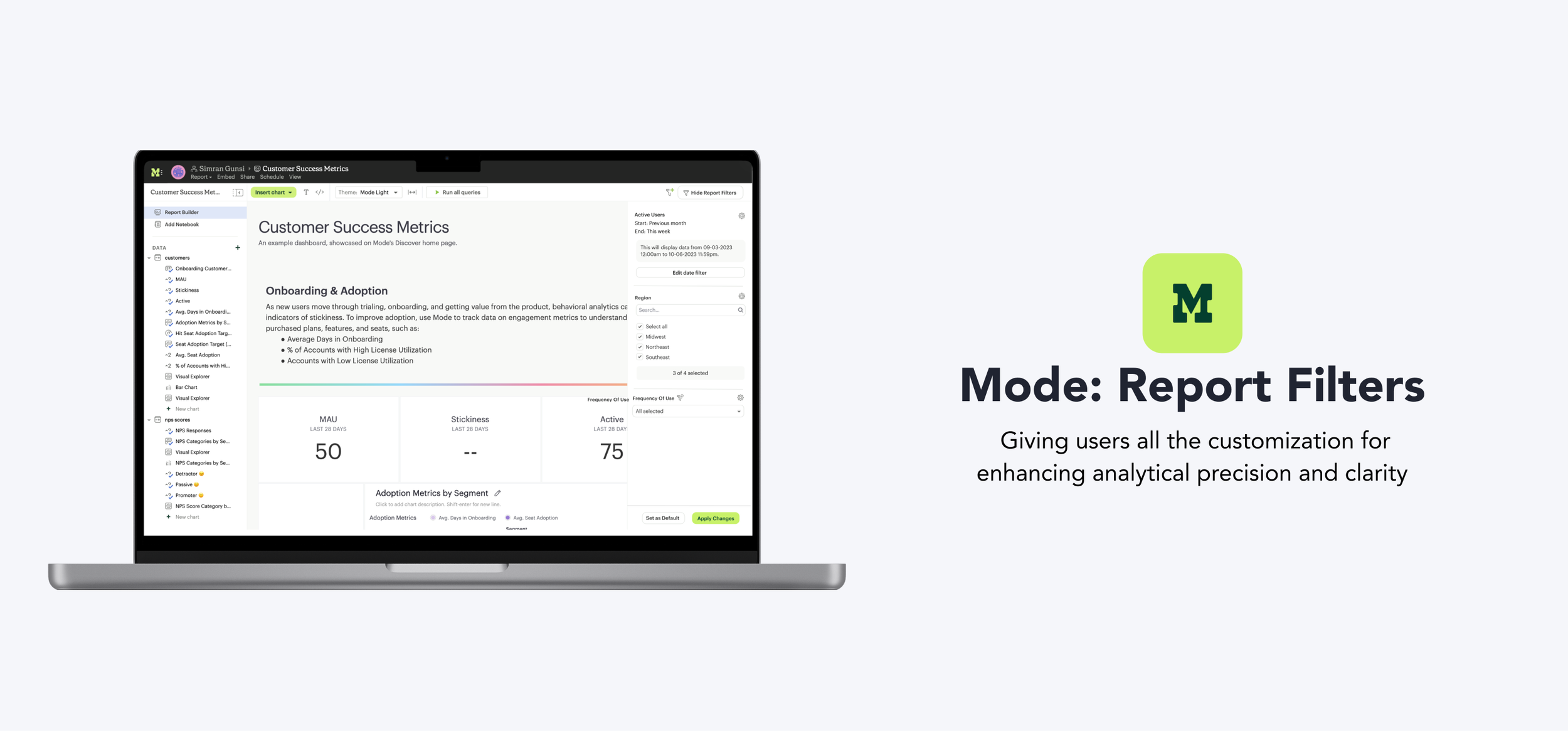
What is Mode?
A tool for data analysts to use SQL, Python, and R, build custom visualizations, and prototype insights quickly. I drove the design work for the Dazery team, alongside a PM and eng manager.
Problem
Users encounter difficulty sifting through extensive data and are limited to basic filtering capabilities within existing reports.
Solution
New filtering capabilities, offering more ways to transform and understand what's going on in their data.

Impact
Prevented churn
of a top customer by addressing key filtering pain points
3.9 → 4.3
user satisfaction score after launch (out of 5)

Set the pattern
for filter design that shipped across future reports
How can we consolidate the data and help present the best filtering options based on the type of data?


Used for point in time analysis
Ex. April 1 – April 7 2024, stays constant once applied

Auto updates with time
Ex. Past 7 days, Last quarter, Rolling window
Dynamically update based on selections in other filters
Ex. Minimizes scroll through unneeded info
Display relevant values filters dynamically adjust the available filter options based on the current data set, ensuring that users only see choices that are pertinent to their other filter selections. We engaged in extensive whiteboarding and brainstorming sessions to understand how the filters interact behind the scenes and determine what should or shouldn't be displayed to users.


After sharing this at a design review with mixed feedback, we decided to conduct user research for additional feedback.
Button Approach

Icon Approach

Sharing with users
We walked through the two options with 6 existing users from varying backgrounds, asking where they thought they would add a new relative date filter, then asked which they preferred. Since we were already introducing the new display relevant values filter icon and users leaned toward the button approach, we went with that version.
4 people preferred the button over the icon
3 people discovered the icon without prompting
2 people thought icon was indicator instead of click point
The compactness of filters averaged at 3.6/5
"The double icon feels confusing. I'm not sure which one to press. I'm sure I could click and find out but on first glance I'm confused"
"The word customize feels very general... You aren't really customizing if you are just setting up the details of the filter"

Redesigned filters now match the product's visual and interaction patterns for seamless integration.
Allowing users to dynamically adjust filters based on data point selections giving business users the capabilities of the data analysts.


Allowing users the ability to dynamically adjust data presentation based on current time frames, simplifying analysis and enabling more efficient and accurate decision-making.
Engaging users early and often was the biggest unlock. Continuous feedback and refinement made the difference between a filter system that looked complete and one that actually worked for the people using it every day.
The hardest part wasn't the filtering logic, it was the collaboration. Getting design, PM, and engineering aligned on the same "powerful but not overwhelming" line was where this project's best work happened.

